Space
Home Colour Schemes: 10 for Peace and Balance
Dr S Pujah · 25 June 2026
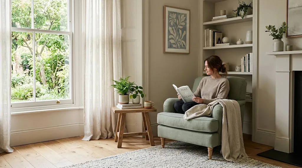
Colour is one of the fastest ways to change how a room feels. The right palette can turn a space from restless to restful. Here are ten calming, balancing colour directions for a peaceful home.
Calming colour ideas
- Soft neutrals — warm whites, beiges and stone for a grounded base.
- Gentle greens — nature's balance; restful and fresh.
- Muted blues — calm, cooling, great for bedrooms.
- Earthy terracottas — warmth and stability in living areas.
- Soft lavenders — quiet and soothing for rest spaces.
Combine a calm base with one or two accent tones, and let natural light do the rest.
Match colour to the room's purpose
Cooler, softer tones for rest; slightly warmer, brighter ones for social and active spaces. Balance is the goal — not too flat, not too loud.
A note
Design and wellbeing guidance; personal taste and results vary.
Frequently asked questions
What colours are most calming? Soft neutrals, gentle greens, muted blues and soft lavenders.
Should every room be the same? No — match the palette to each room's purpose, keeping an overall balance.